The platform nobody had defined yet.


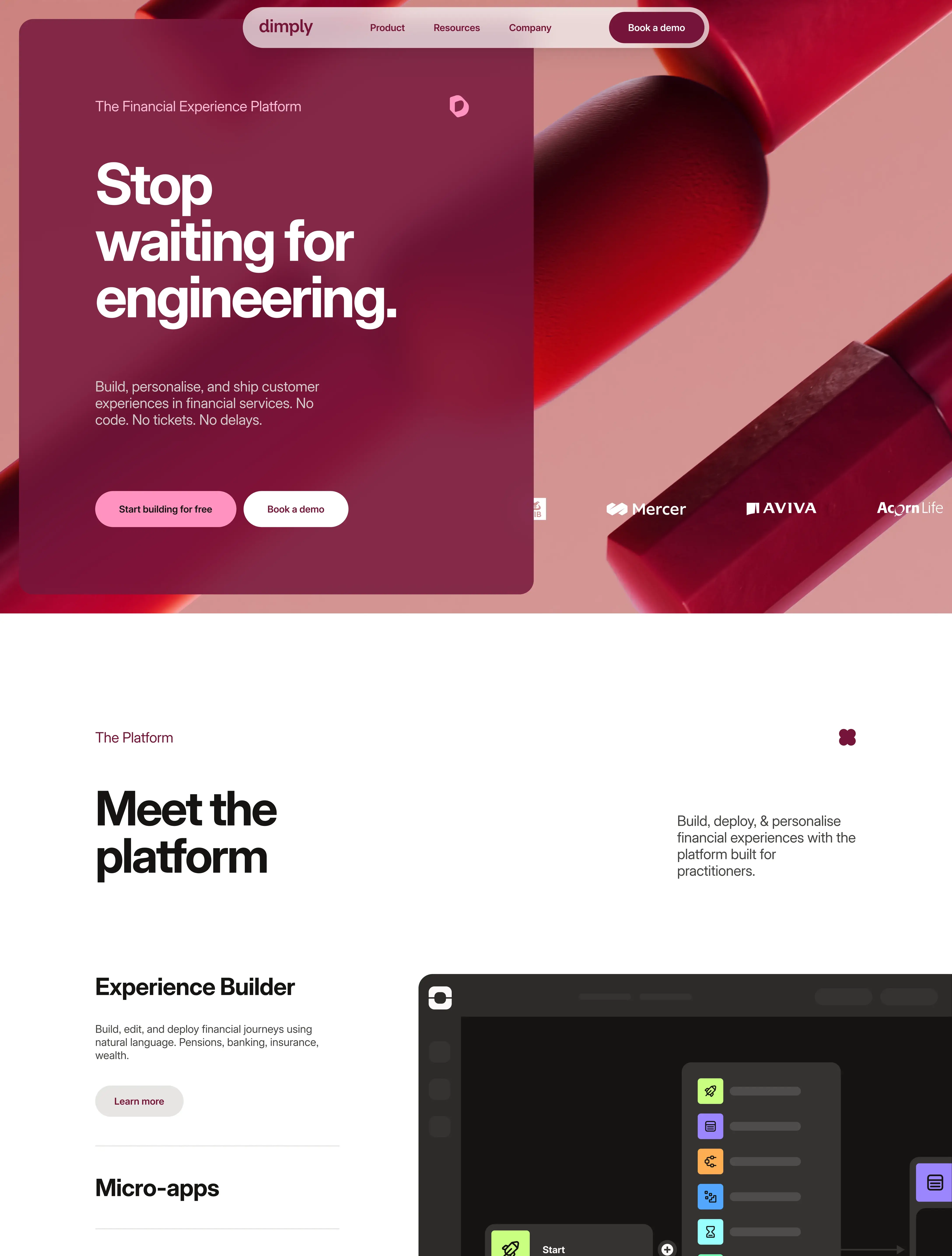
- → Category positioning framework
- → Feature architecture and naming
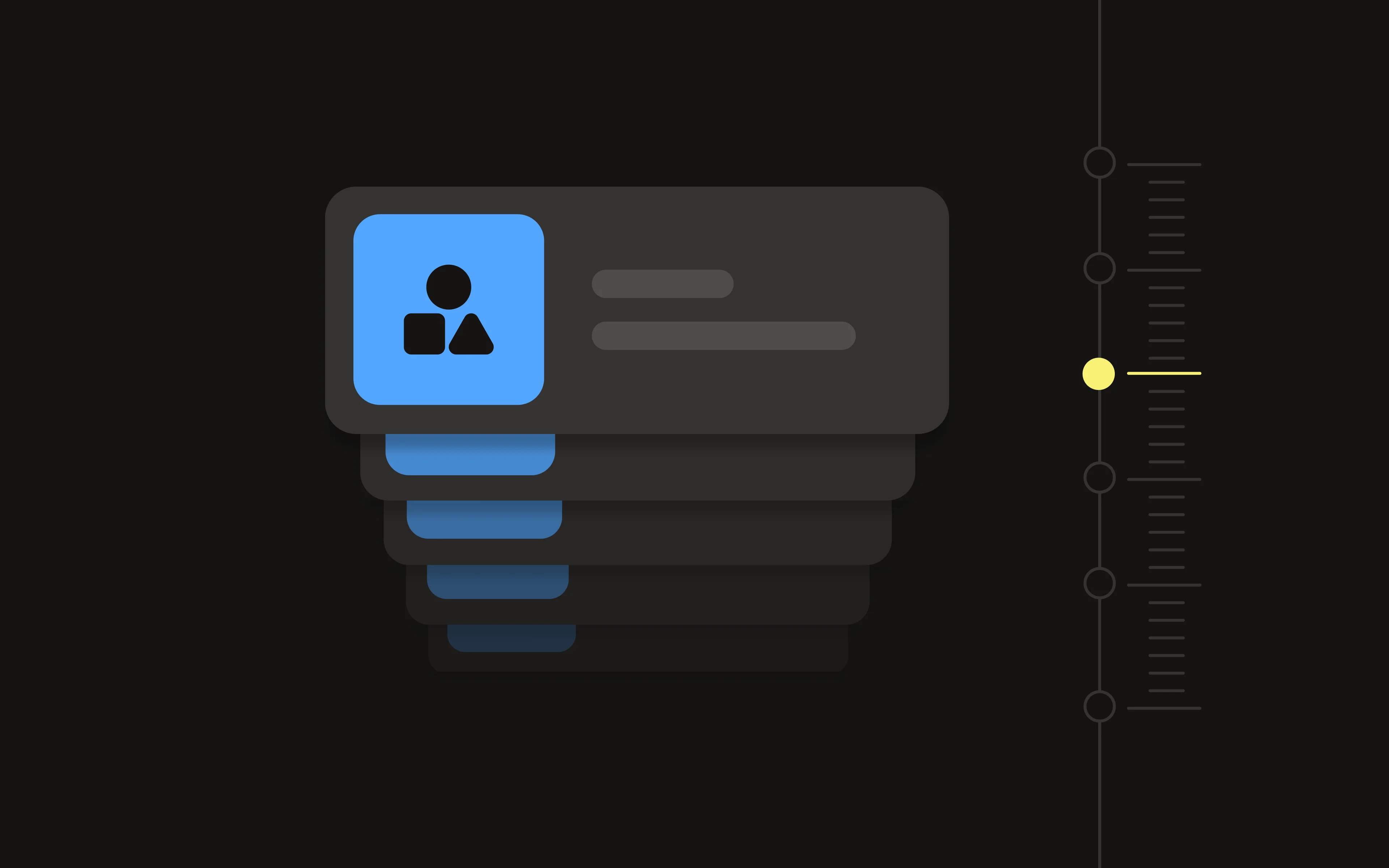
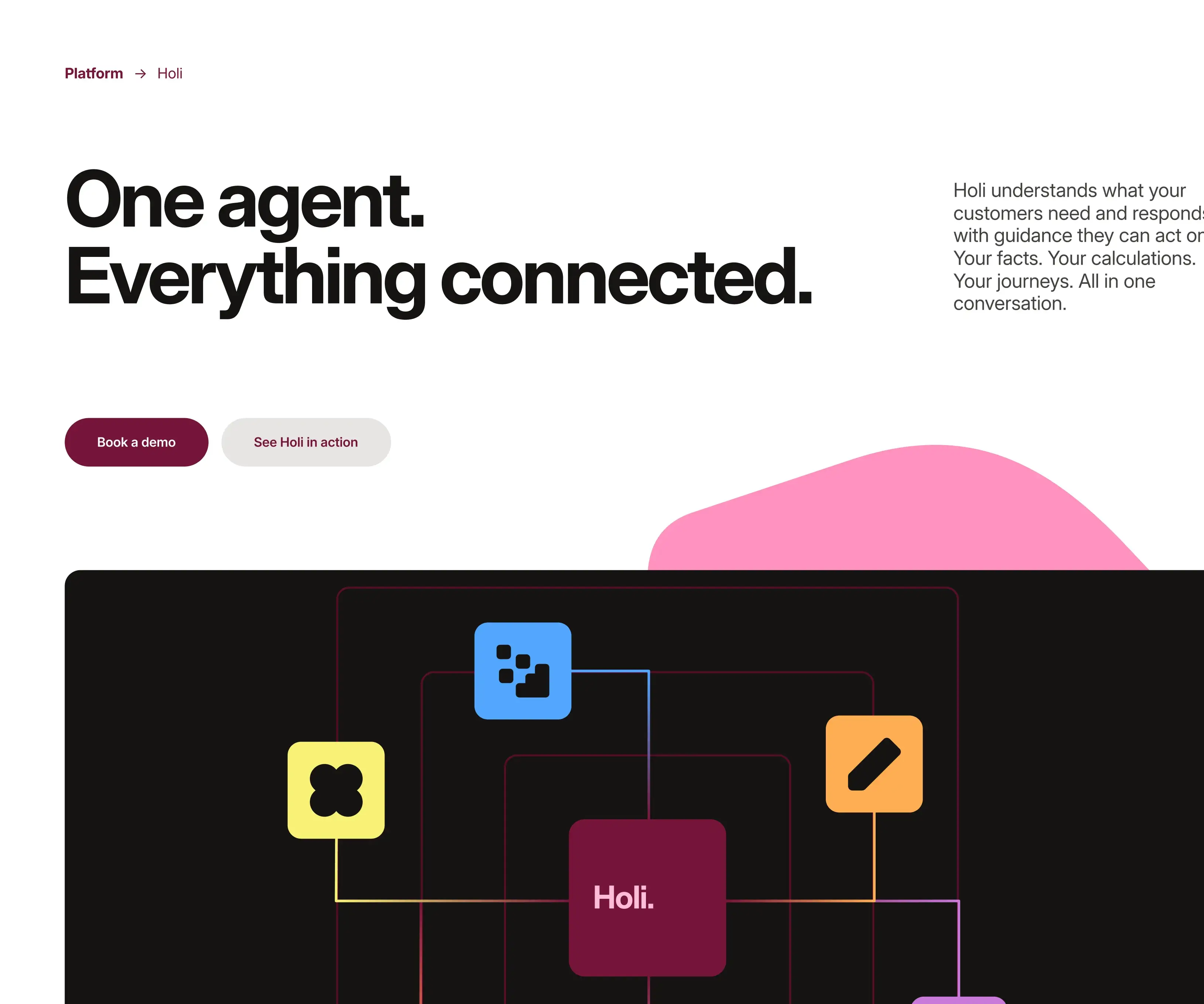
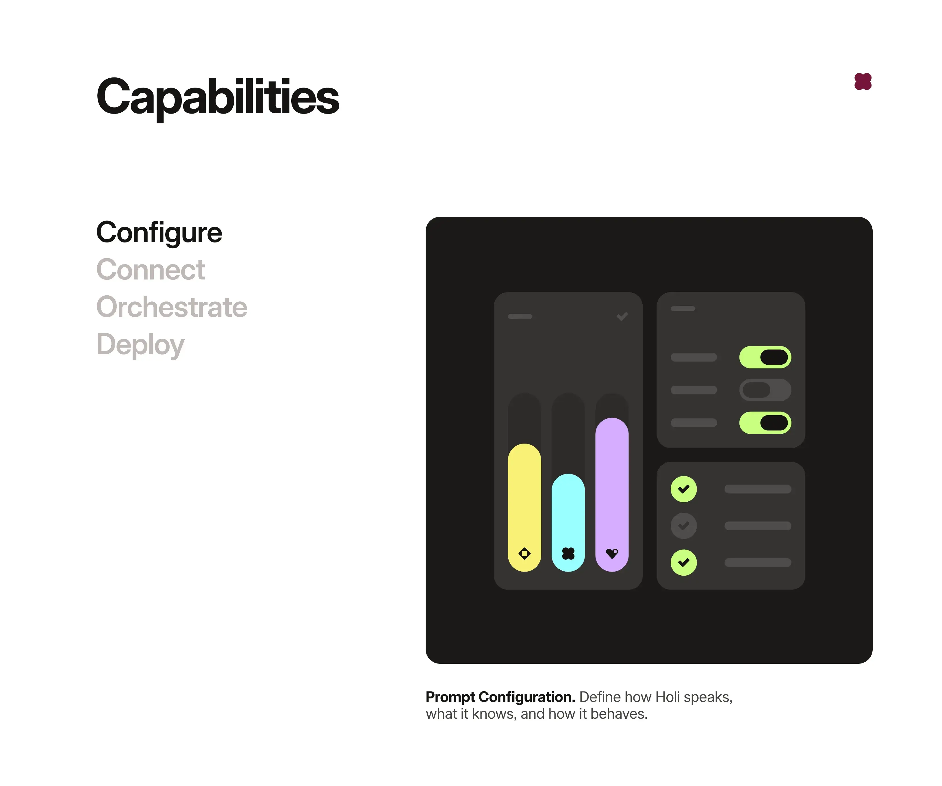
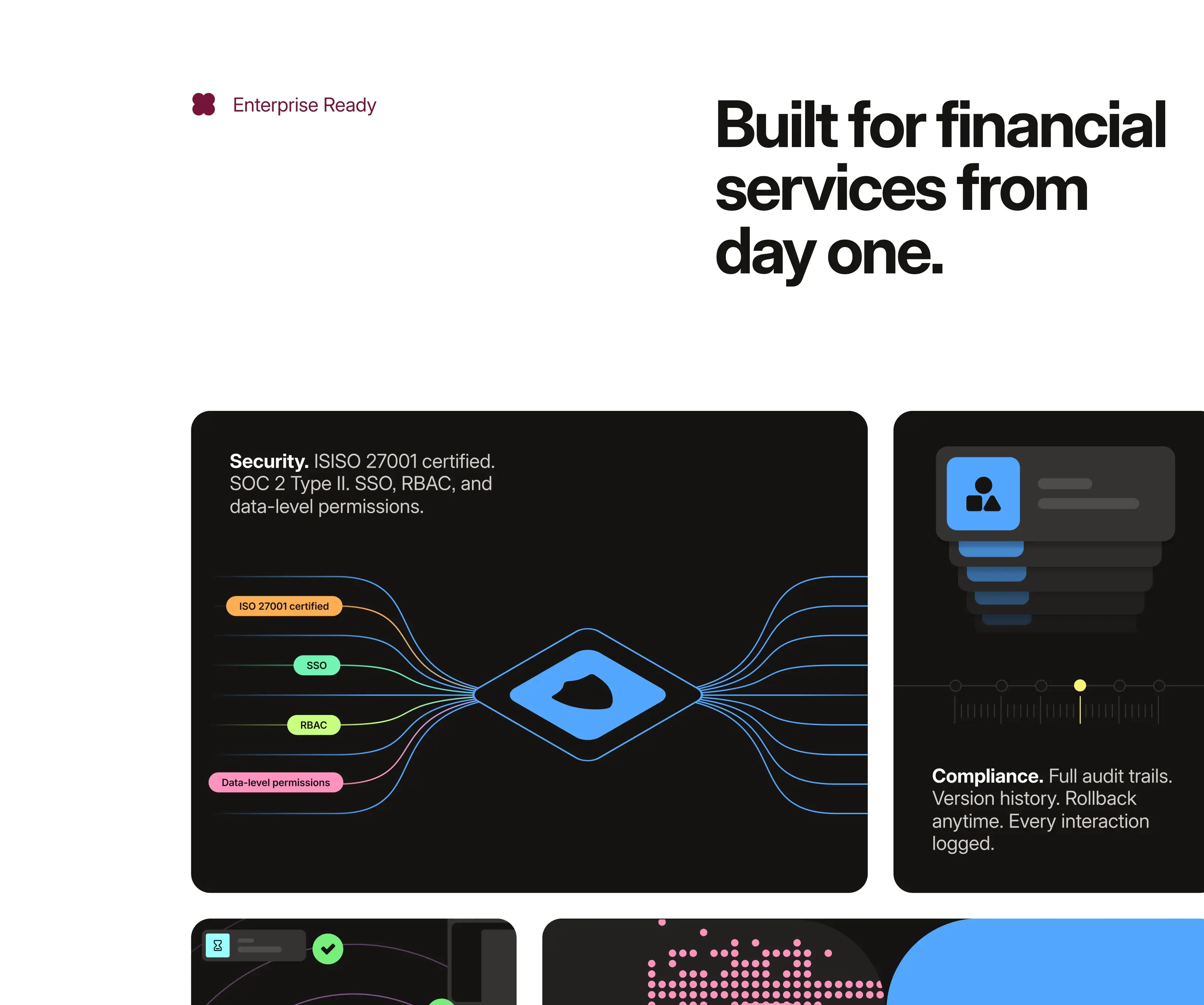
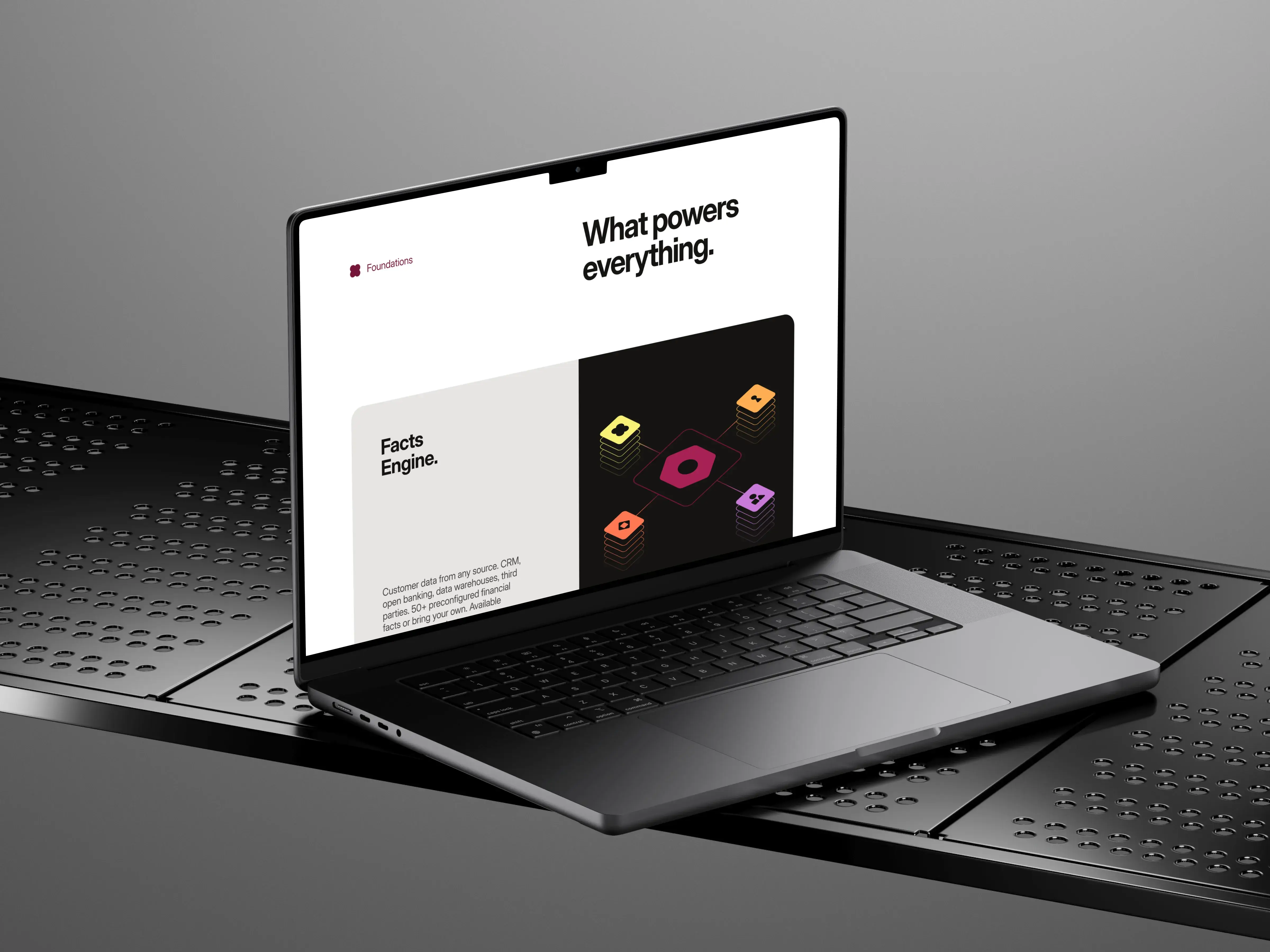
- → 53 product visualisations
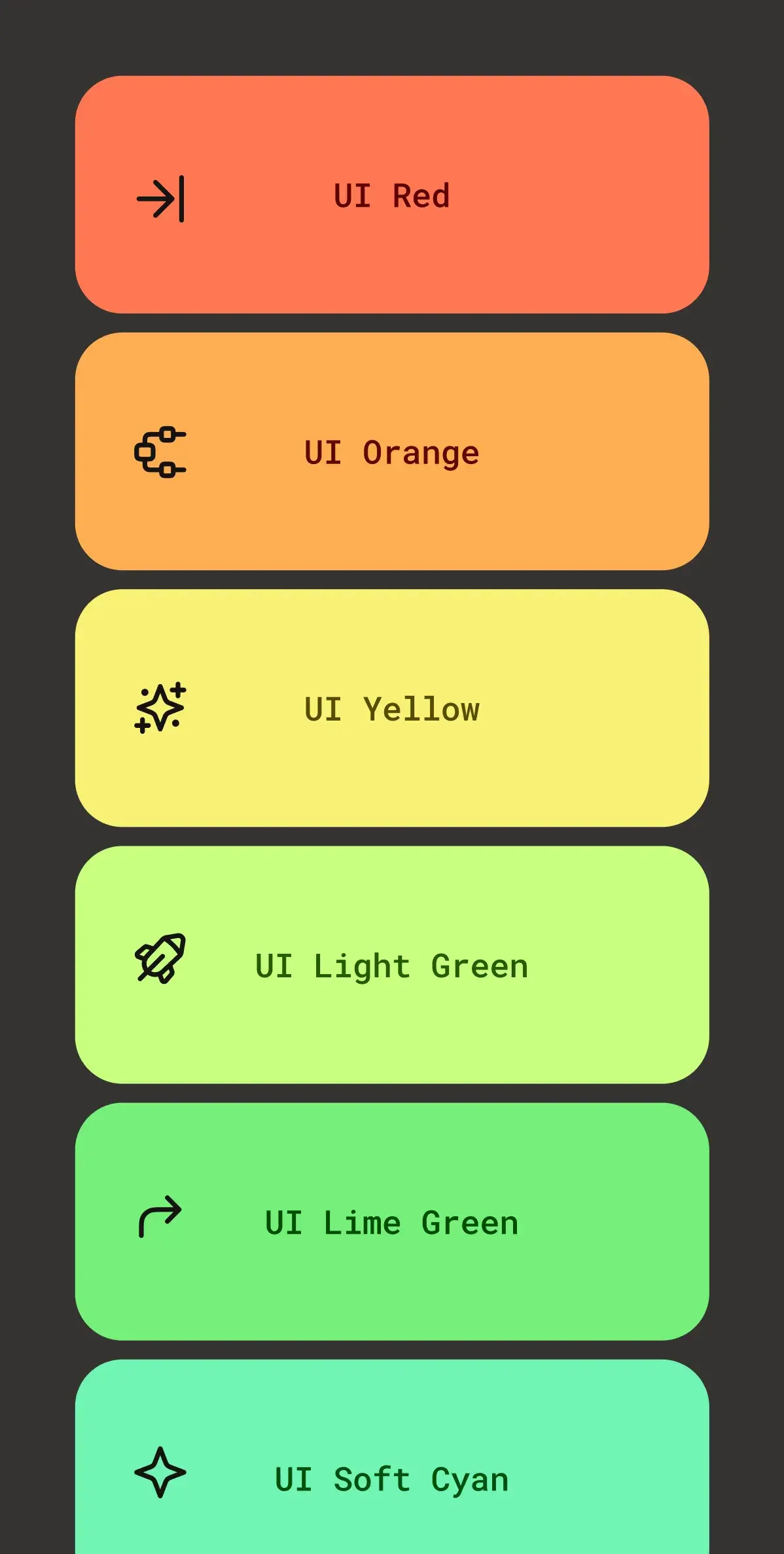
- → Platform visual language
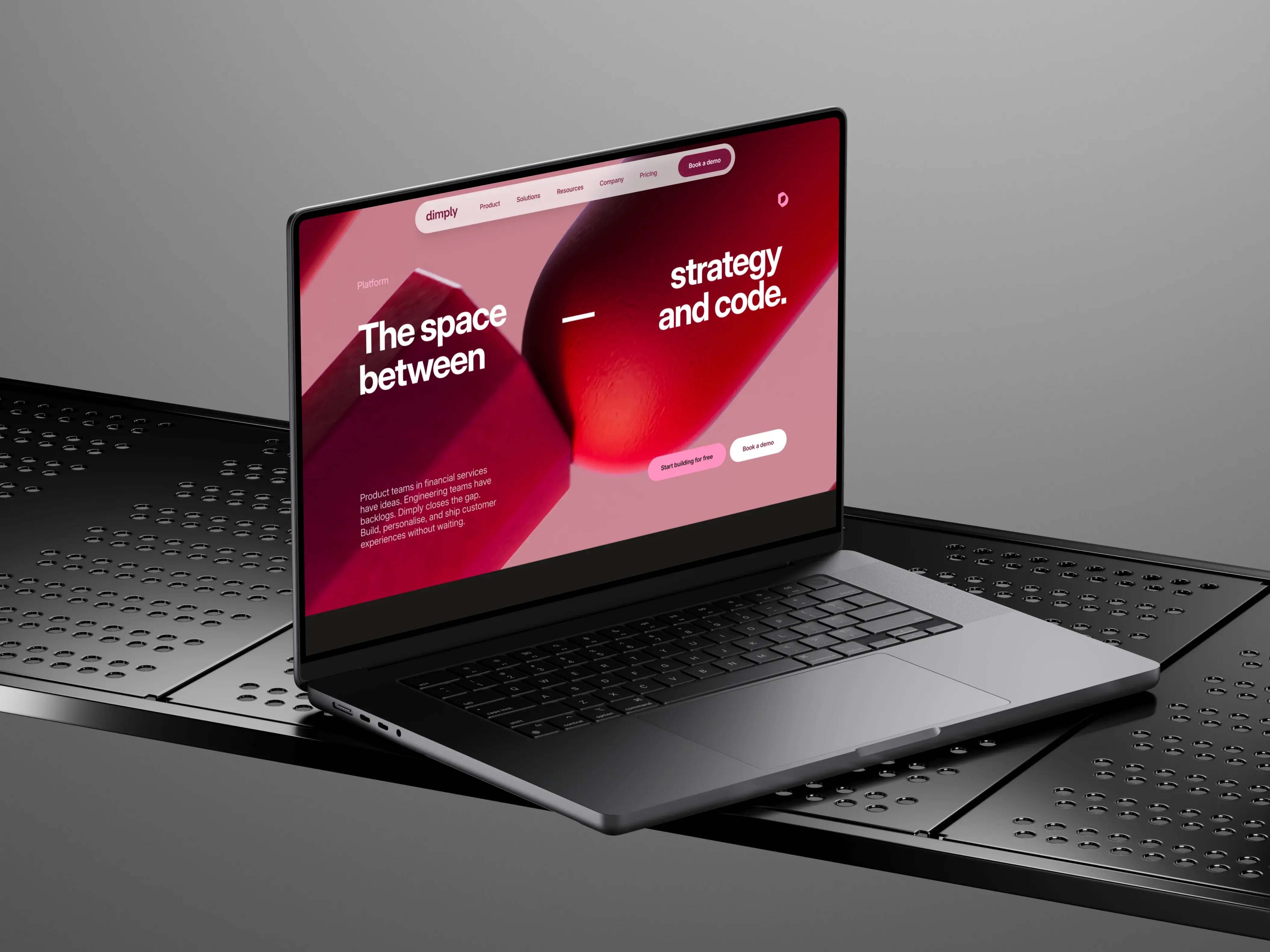
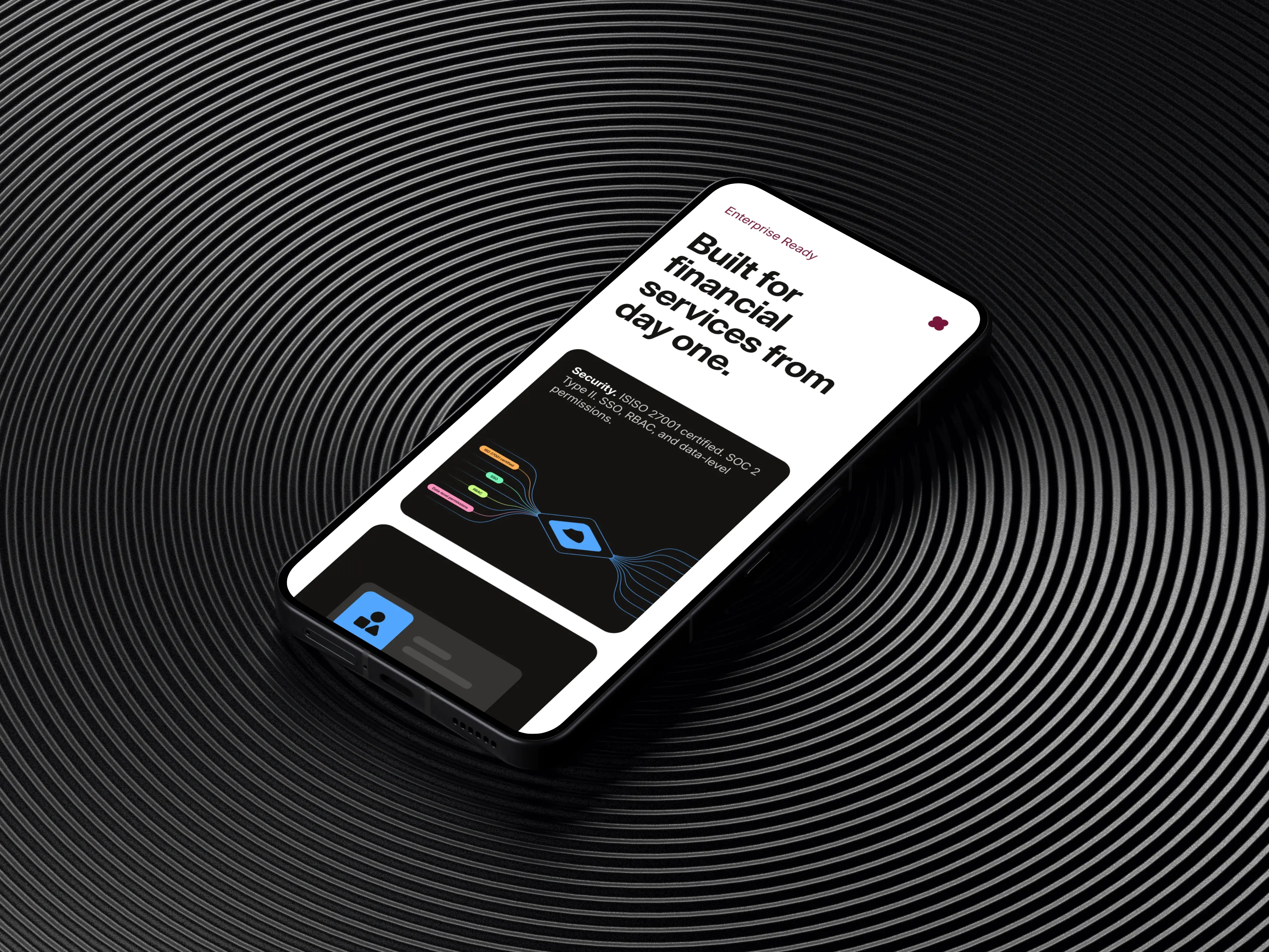
- → Website design and direction
Product visualisations created once the positioning was defined
This is a Design Partnership. Ongoing embedded work across positioning, product, and brand. Not a one-off project.
The situation
Dimply had built a genuinely powerful platform. A branding agency had delivered a strong visual foundation. A sitemap existed. Content was being written. On paper, everything was in place to build a website.
But something kept not working. Sections felt like parts rather than a whole. Pages were designed, redesigned, and set aside. The founder was visibly blocked.
The diagnosis
The real problem wasn't execution. Nobody had clearly defined what Dimply actually was yet. Six months in, we stopped and named it.
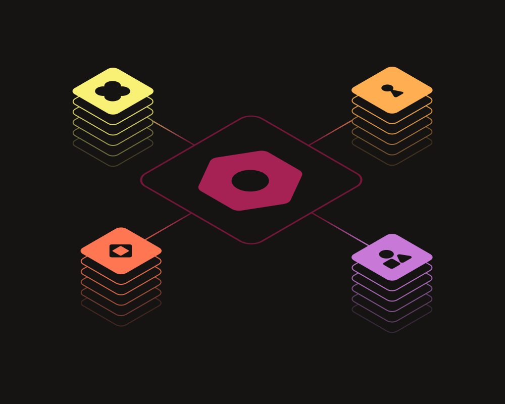
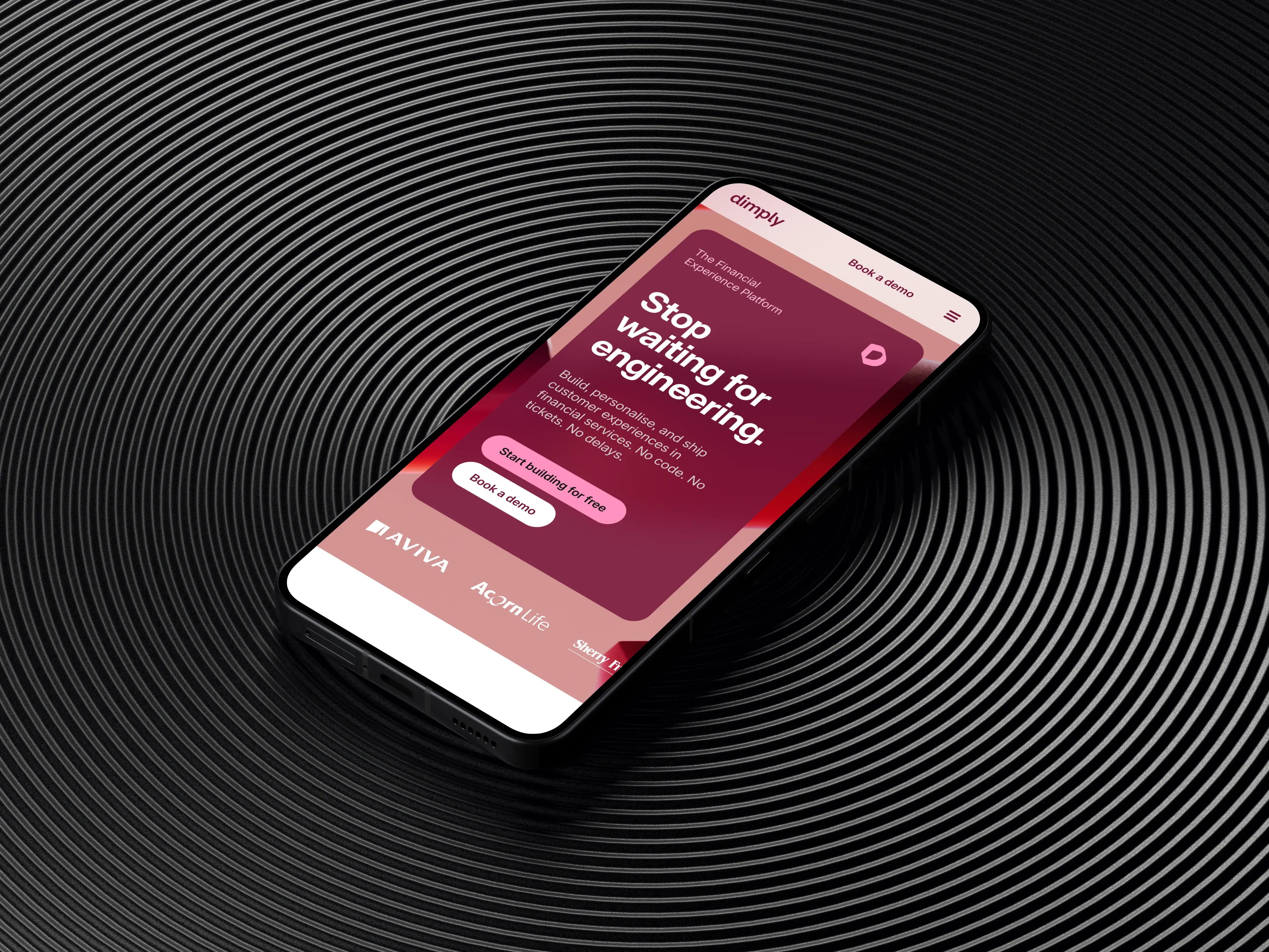
What emerged was clear: Dimply needed to lead with category ownership as the Financial Experience Platform, and then productise its individual features so each one could stand on its own.
The outcome
Once that structure existed, everything moved. Content made sense. Page hierarchy became obvious. The design had something to carry.
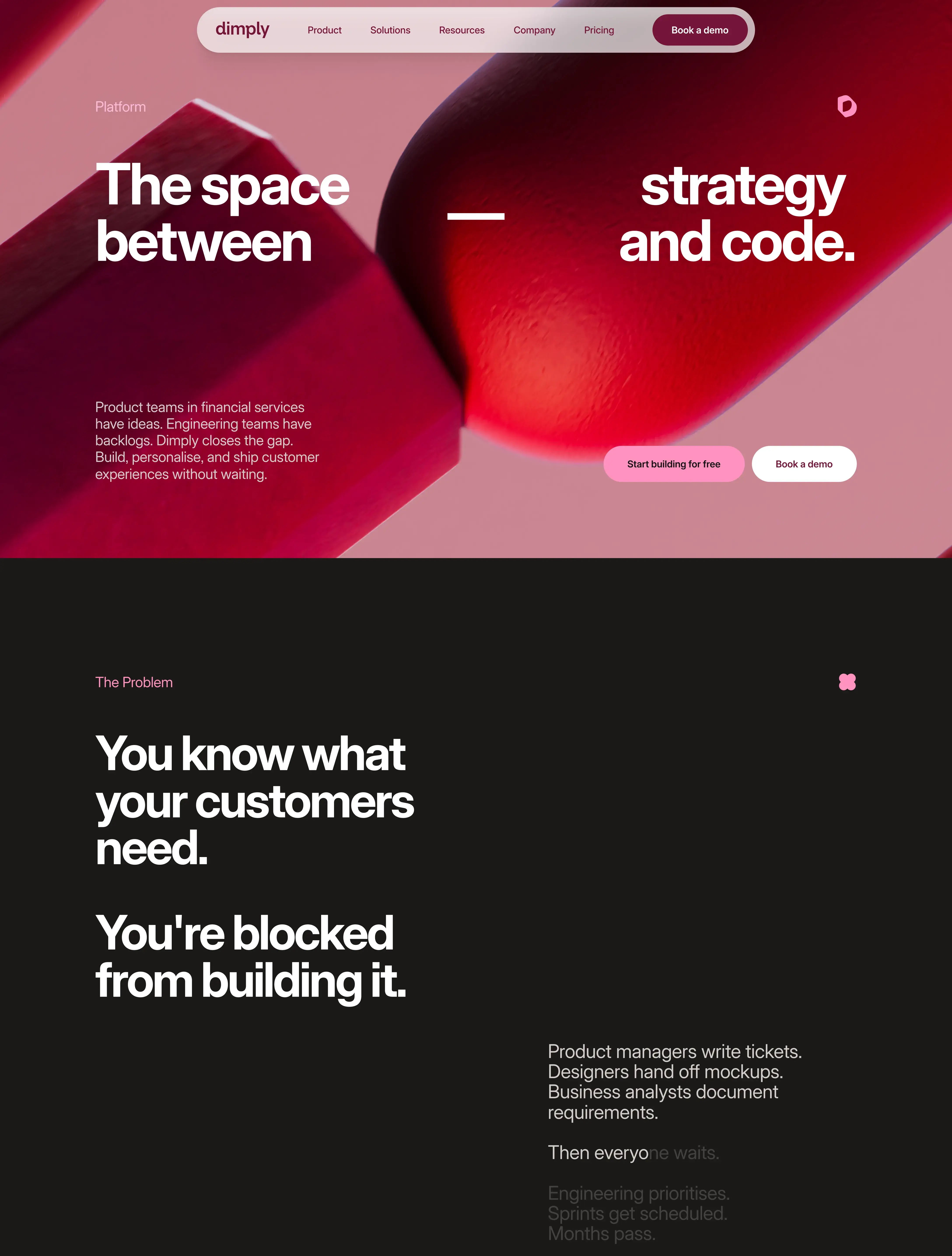
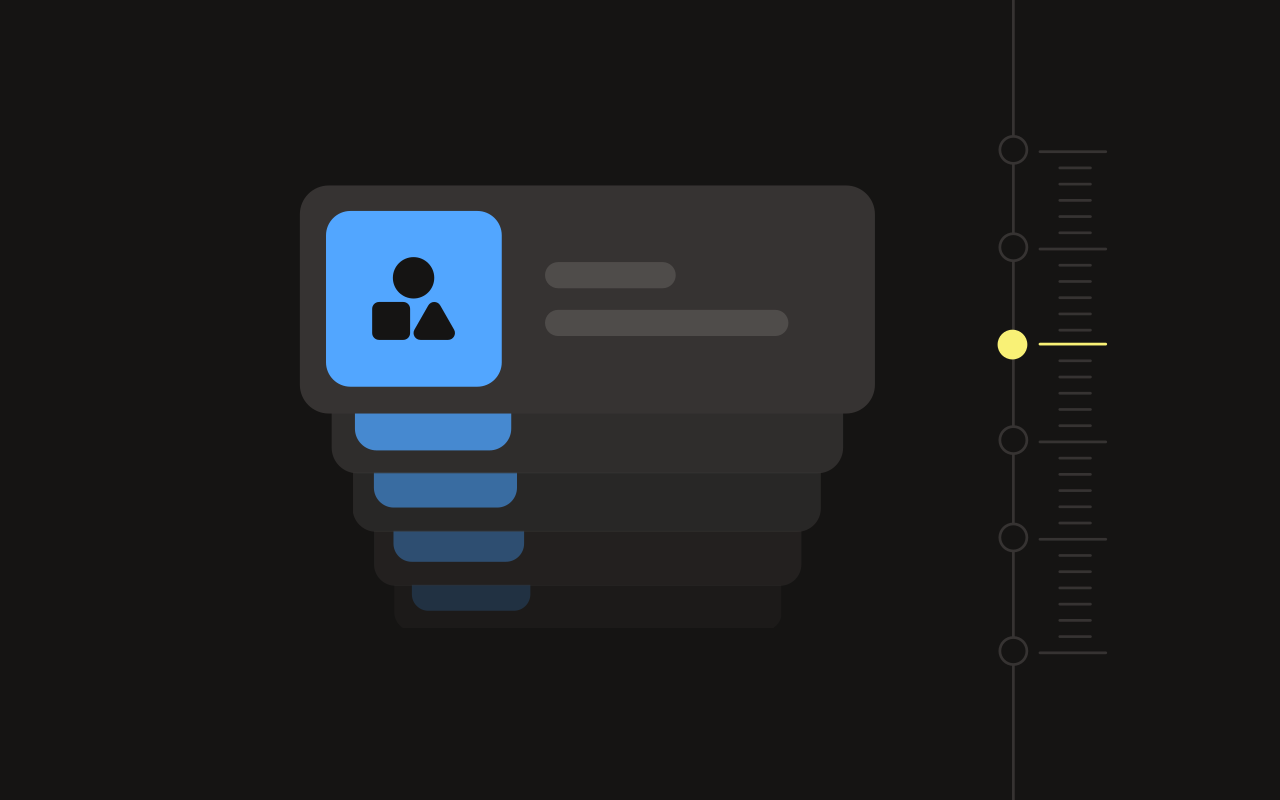
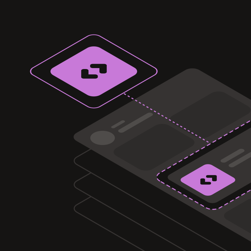
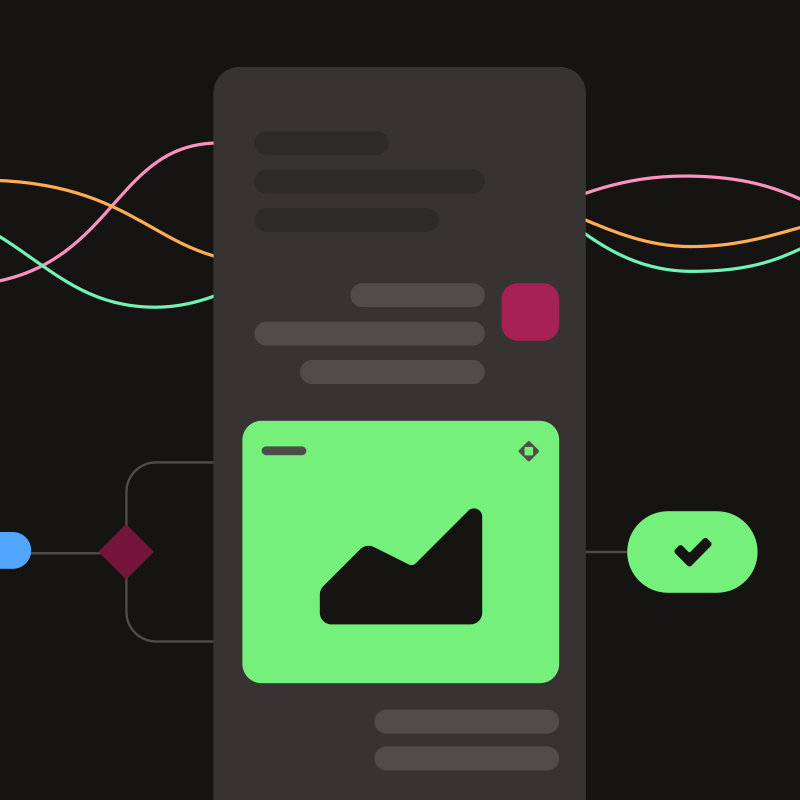
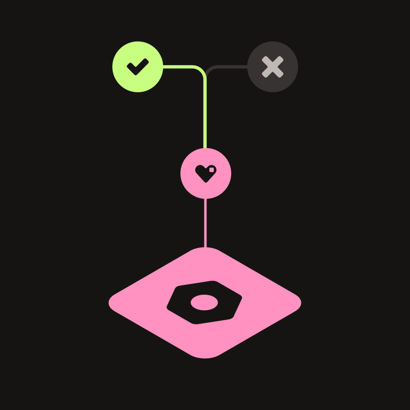
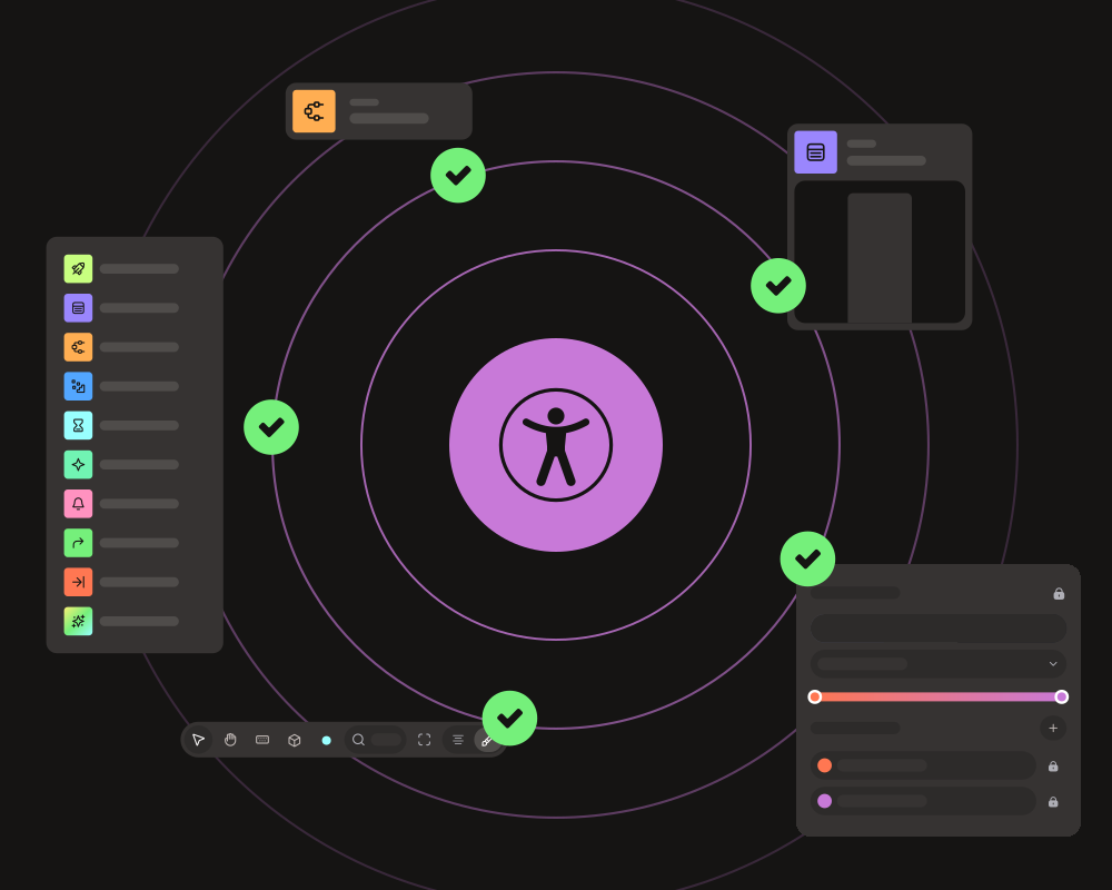
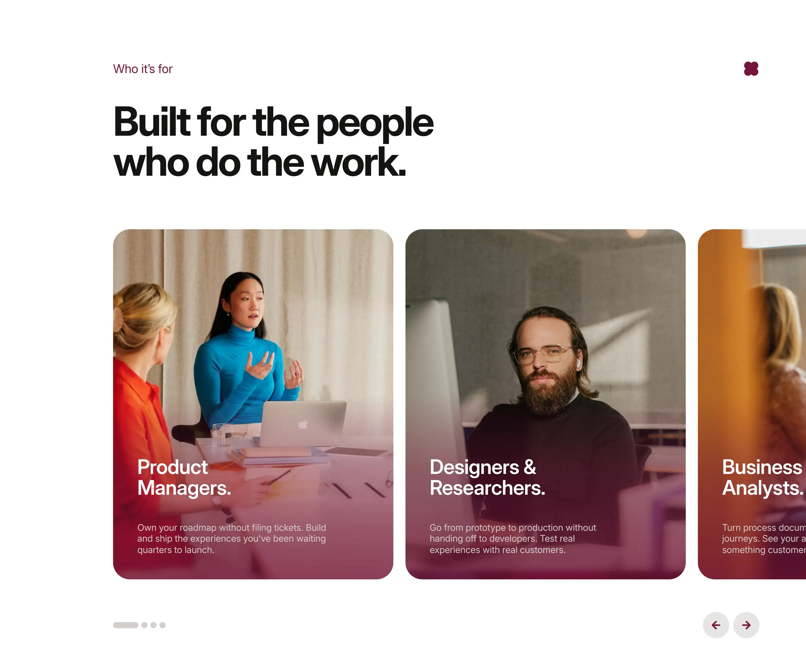
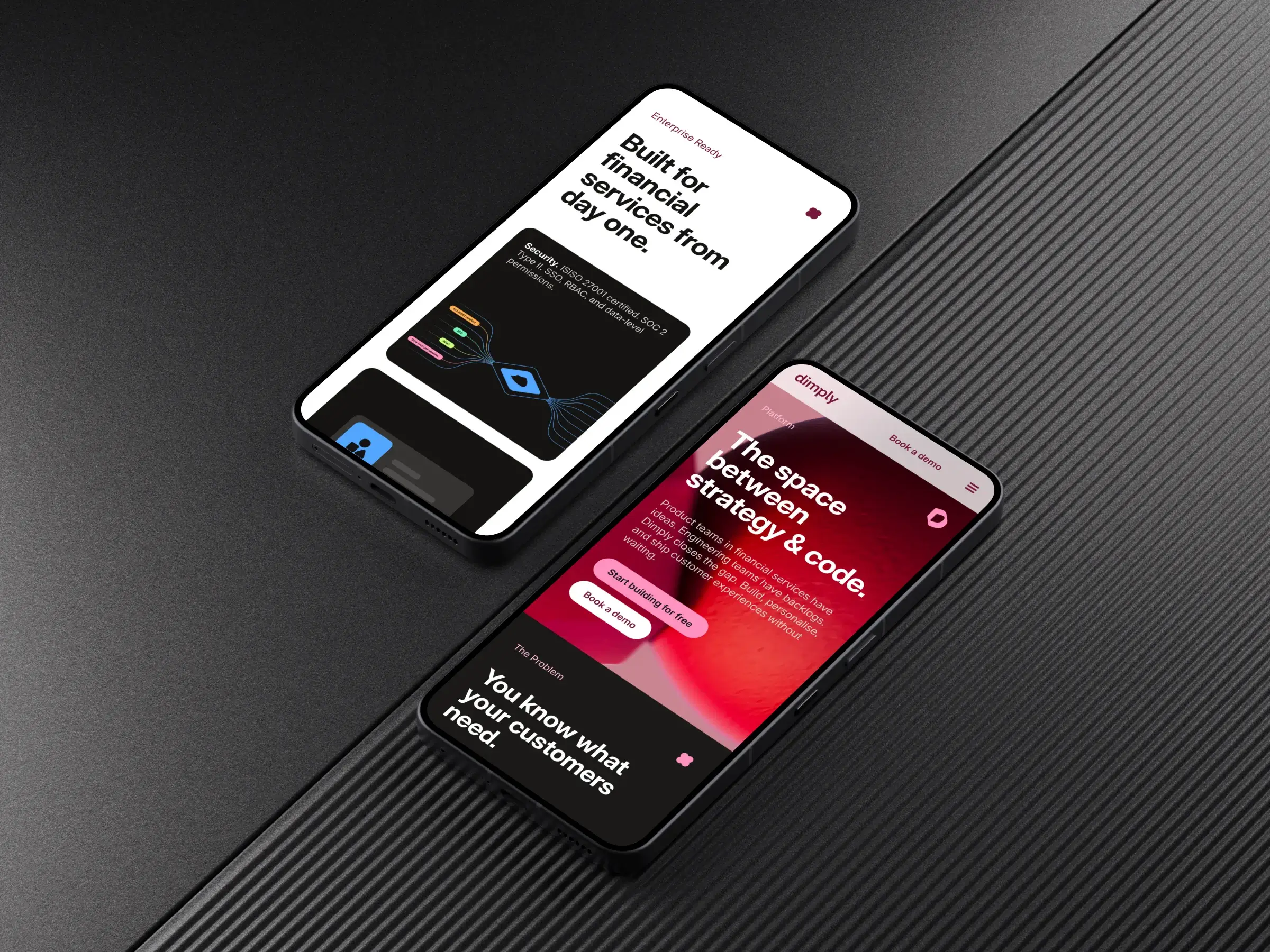
We produced 53 product visualisations, a new visual language for a complex platform, so that a product team at a bank could look at the site and immediately understand what they were looking at.

.svg)
.svg)


.svg)
.svg)
.svg)
.svg)
Name the real problem and the output takes care of itself.
Most teams start with the surface.
The leverage is almost always one step earlier.